Case study · 02
Rent My MBA
A redesign for a Ugandan pharmacy consulting practice. I did it twice.
What Rent My MBA is, and why their site wasn't saying it.
Rent My MBA helps Ugandan pharmacy owners run their businesses better: operations, finance, regulatory navigation — the side of pharmacy that nobody trains pharmacists for. Derrick has decades of his own pharmacy operating experience, an MBA, and a published book. The practice is real.
The website didn't reflect any of that. Generic template, vague hero, services list buried, the book mentioned almost in passing. The kind of site that makes a credible business look DIY. I asked if I could redesign it as a spec project. He said yes. He's been hands-off throughout, which means everything in this case study is mine: the decisions, the wrong turns, and what I learned from doing the same redesign twice.
What I designed when I was learning what design tools could do.
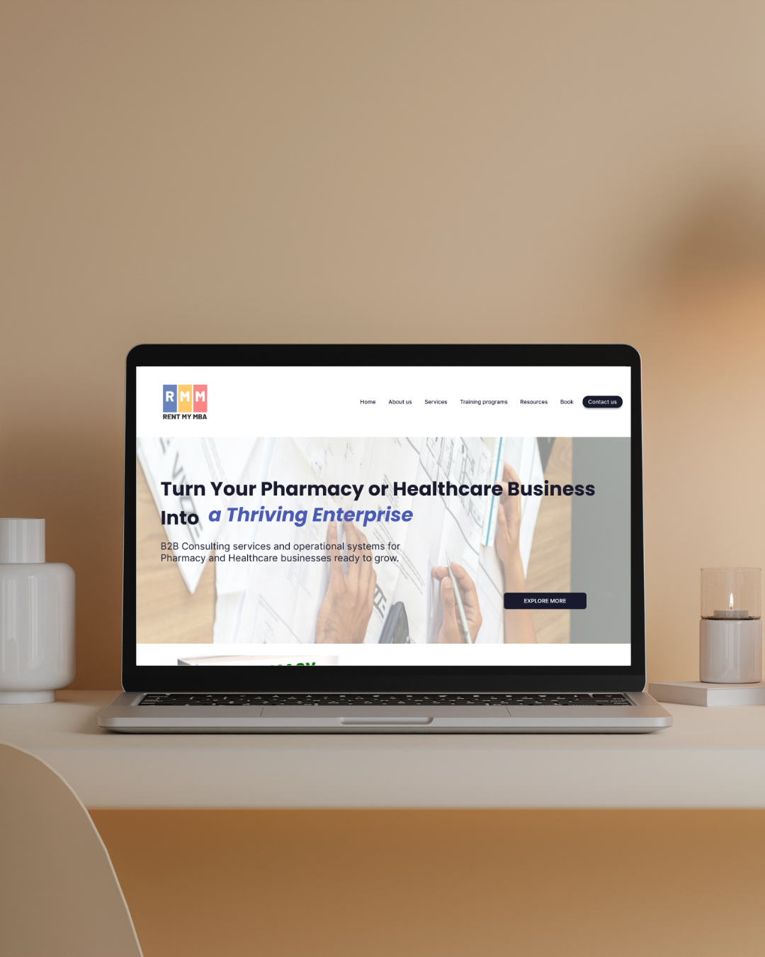
I built v2 about six months into design. Real photos instead of stock placeholders. A proper book section on the homepage. A dark testimonial band. Card grids with rounded corners. Compared to the original WordPress template the practice was using, it was a real step up.
But look at the hero: "Turn Your Pharmacy or Healthcare Business Into a Thriving Enterprise." That sentence is the original site's sentence, lightly edited. It means nothing. Anyone could say it.
I'd gotten better at executing the brief. I hadn't yet realised the brief was the problem.
The shape of the site: home, services, training, book, contact.
I kept the multi-page structure. The default move in 2026 is a long-scroll one-pager, and I tried it first — prototyped the full site as a single anchored scroll with Claude Sonnet, just to feel it at full length. It was a slog. I couldn't sit through it myself, and a pharmacy owner busy at 9pm definitely wouldn't.
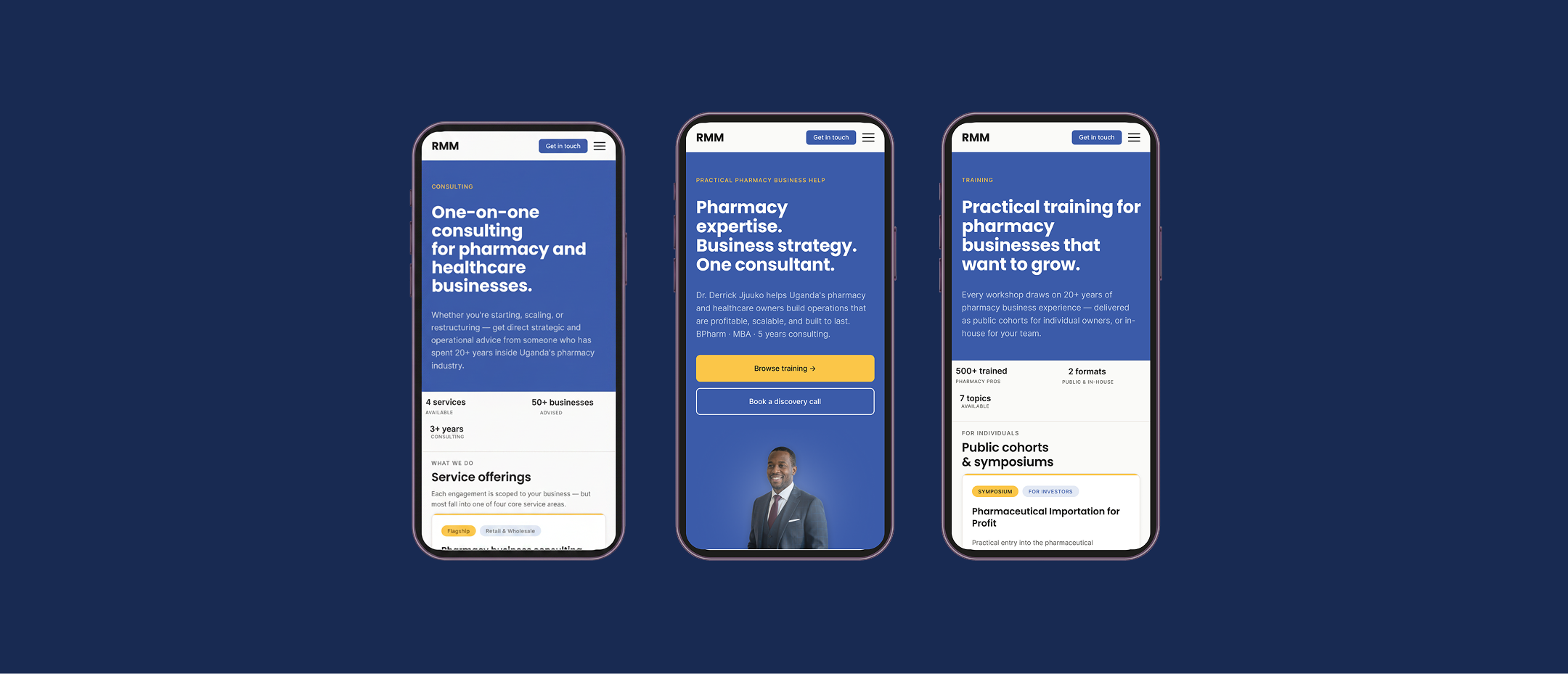
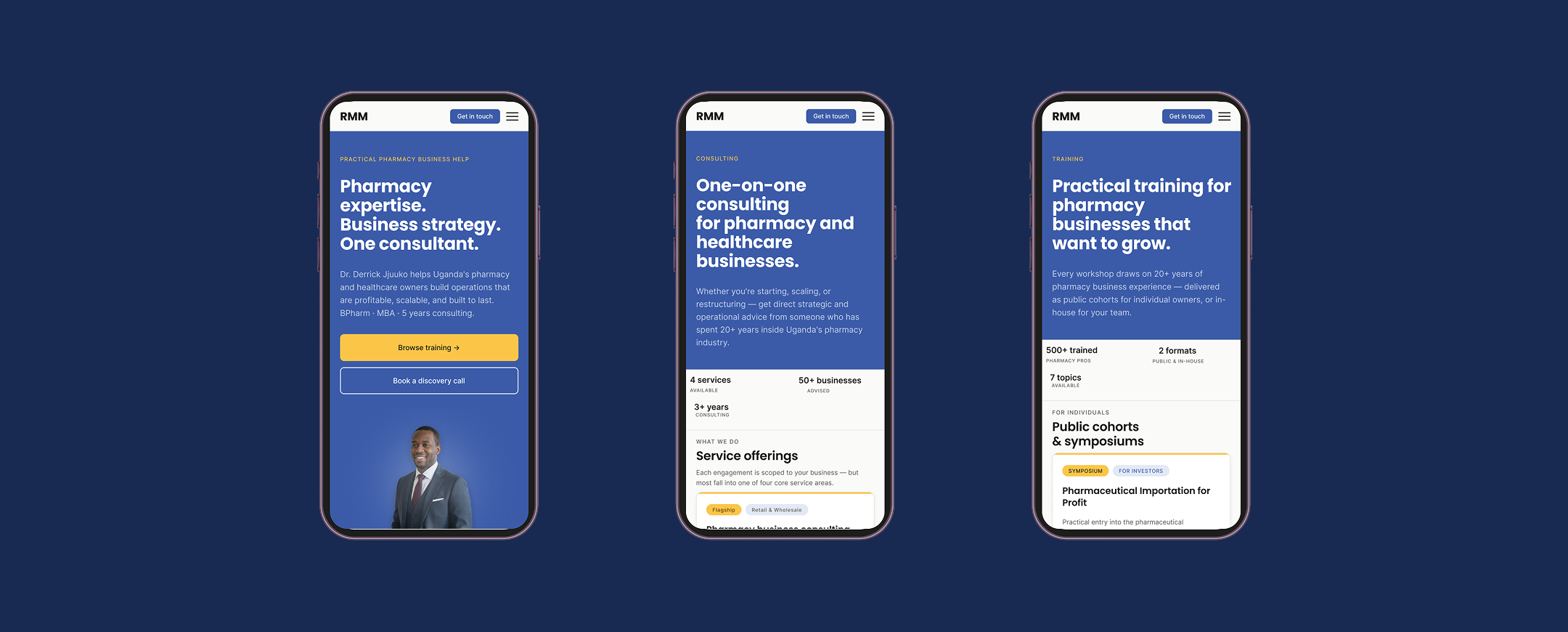
Multi-page came back. Seven pages: Home, About, Services, Training, Training deep-dives, Resources, Contact. Each page carries its own pitch. Each one earns its place.
Same hero structure on every page.
Every page uses the same hero structure: small letterspaced kicker, H1, supporting copy, sometimes a stat strip. Same proportions, same type sizes, same horizontal padding, same divider beneath. Different shades of navy depending on the page's role, but the shape is identical.
This is the kind of decision that's invisible until you notice it's missing. On the original site, each page had a different hero treatment, which meant navigating between them felt like jumping between websites that happened to share a logo. The unified pattern does two things. It makes the pages read as one property. And it lets a visitor land on any page from a search result and immediately know where they are.
Taxonomy disguised as a badge.
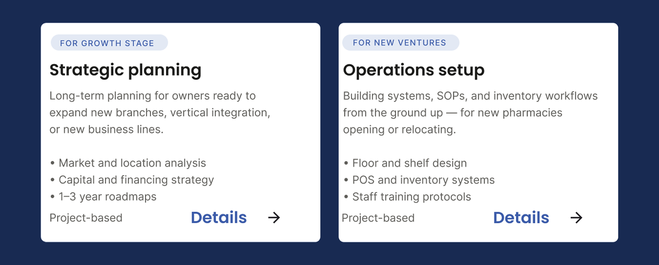
The original site had a services list. Just a list. Every service got equal visual weight, with no signal about who each one was for. A first-time pharmacy owner and a multi-branch operator were being asked to evaluate the same cards the same way.
I introduced a tag system on every service and training card: Flagship, For new venture, For growth-stage, For investors, For owners, For operators, For multi-branch. The flagship tag uses a gold accent; the rest are neutral. The tag sits at the top of each card so it's the first thing a reader processes (is this for me?) before they read the title.
This was the design decision I'm most proud of, and the one nobody would notice unless they were looking for it. It's not a visual flourish. It's IA work. Taxonomy disguised as a badge. It lets the same card grid serve four different buyer types without any of them feeling lost.
What designing the same thing twice taught me.
What v2 taught me
That getting better at design tools is not the same as getting better at design. V2 was a more skilful execution of the original site's thinking. It looked good. It also said nothing. Polish without rewriting is a trap you can fall into for years if you don't notice it.
What the no-stock-photo rule taught me
That self-imposed constraints can do work that briefs can't. The visual rule pushed me into the content. Real specifics required a real pitch. The constraint wasn't a discipline. It was a wedge.
What the one-pager prototype taught me
That prototyping with AI tools is genuinely useful when you use them to test a structural hypothesis fast. I built the entire one-pager in a few hours with Claude Sonnet, not because I wanted to ship it but because I wanted to feel it at full length before committing. The prototype failed its test, which saved me weeks of designing toward a structure that wouldn't have worked.
What I'd build differently
The site is built with Claude Code as the coding partner. For Derrick, that's the wrong choice. He can't edit copy, swap the book cover, or add a training program without involving me. If this becomes real client work, it should be in Webflow with a properly structured CMS so he can maintain it himself.
What this project taught me overall
That the hardest part of redesigning a small-business website is rarely visual. It's that the business hasn't finished writing itself. The original RMM site wasn't ugly. It was unfinished thinking. V2 was a better executed version of that unfinished thinking. V3 was where I stopped trying to make the existing site look better and started trying to make the business sound like itself.